Connecting young adults with working professionals for social mobility
UX Research/Design
Overview
In 2021 I began mentoring a small group of students and realized how difficult it was for young adults to navigate networking without the aid of a classroom. The YPH is my personal research to understanding the importance of networking and barriers young people face to access despite access to digital tools and engaging in online peer environments.
Role
UX Researcher, Experience Designer, Visual Designer
Tools
UX Research, Google forms, Marvel, Figma
Timeline
3 months
Problem
The Young People Hub (YPH) connects young adults with working professionals for social mobility. Recognizing socio-economic backgrounds play a key role in young people’s social mobility, this web-to-mobile application is designed to be accessible as a social tool to empower those experiences.
Challenge
Social mobility is often linked as a top asset for job searching. For young adults entering career pathways or education, it can be especially difficult to network if coming from an underprivileged background. My objective was to design a solution based on social media apps that can better prepare young people for these opportunities to network.
Research
Secondary Research
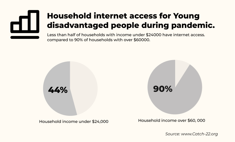
Social mobility is essential to employment. It creates networks, trust, belonging and confidence. Even though many young people are online, a great majority are left behind when it comes to using technology to access digital skills, and find career oriented solutions and networking opportunities.

Bonding vs Bridging
A lot more young people are on social media, but this does not always translate to digital skills. Social media does not train on essential digital skills like accessing documents, research or professional networking. Having a smart phone does not always mean that there is access to household internet as we can see.

Which groups of young adults are being left behind? What needs to be in place for these people?
Disadvantaged young people rely much more on experiences outside of the home and require creative ways to find networks and learning opportunities; and if you come from a disadvantaged background, you’re less likely to want to make mistakes and take risks.
Young people who go directly into a university after high school will have access to mentors and professionals who show them LinkedIn and other networking opportunities.
Competitive Research
I looked at 3 different media companies for a competitive analysis: Instagram, LinkedIn, and Nice.
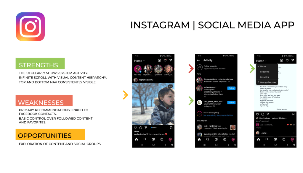
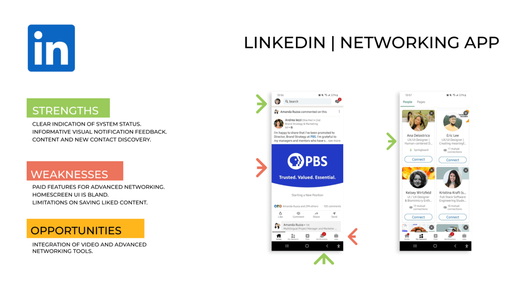
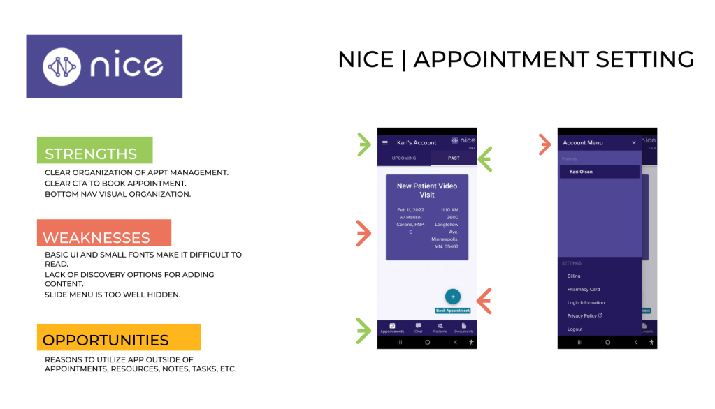
Based on my research, I knew I needed to focus my competitive research on social media apps to connect to the young adult audience for three main features:
- networking
- social feeds
- appointment setting
Discovery
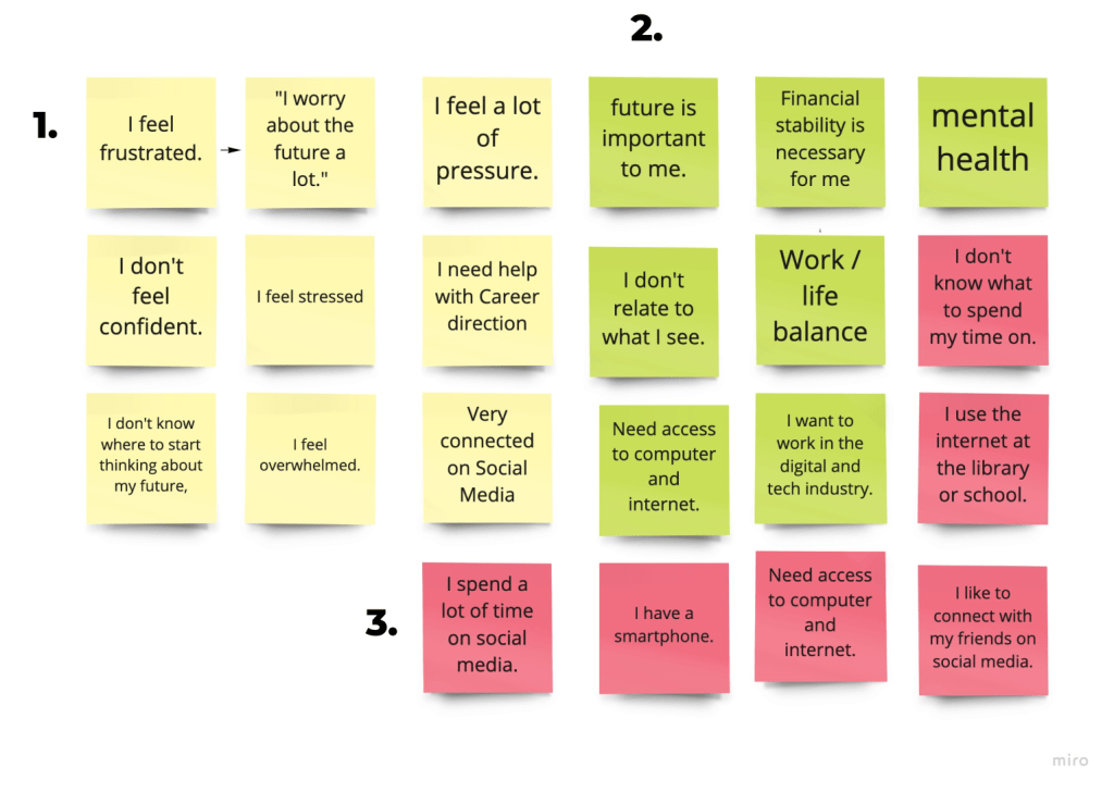
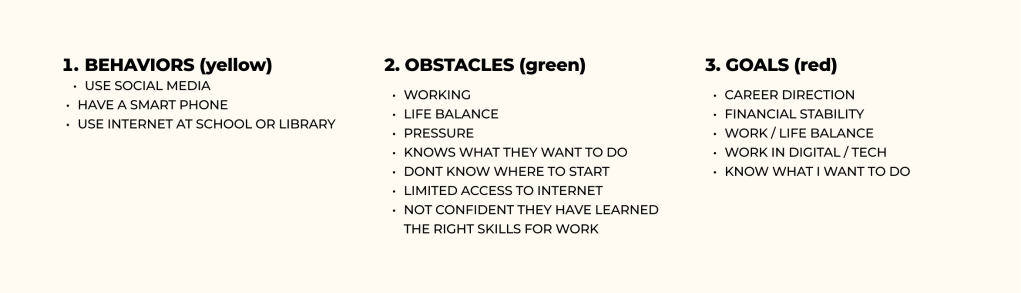
Affinity Mapping
Realizing my limitations in reaching a large number of users in the target audience, I downloaded user interviews with young adult profiles provided by Catch22, a public service organization that works with young people to obtain sustainable employment in order to access young adult interviews and career-related conversations.
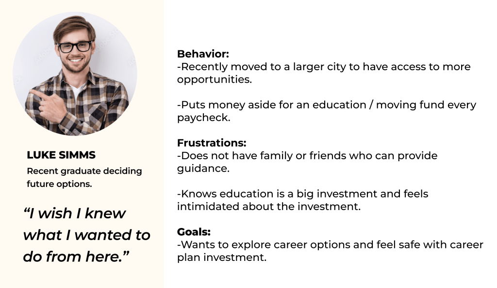
Personas
Understanding these obstacles, behaviors and goals, I was able to distill two distinct personas that would benefit from a social networking service.
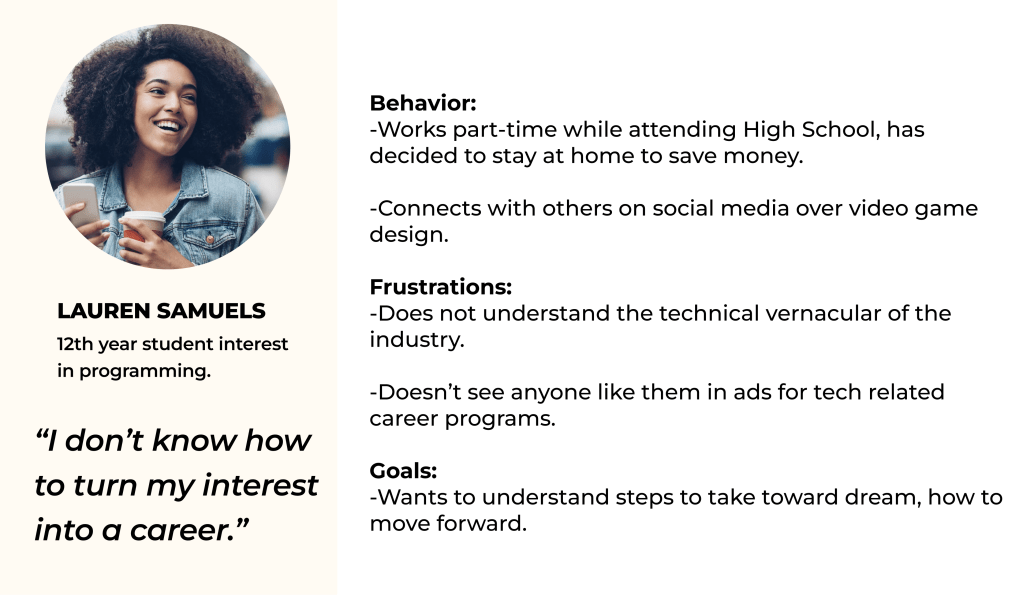
Looking at research thus far in the frame of my personas helped me validate the need for a social networking tool designed for young adults. From here I was able to formulate my three How Might We questions:
- Help disadvantaged young adults have access to digital role models.
- Provide tools and encouragement that aligns with one’s lived experiences.
- Help young adults avoid negative impact by creating career-oriented goals.
Ideation
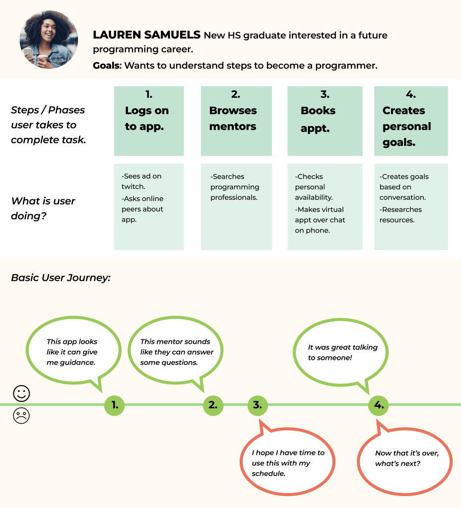
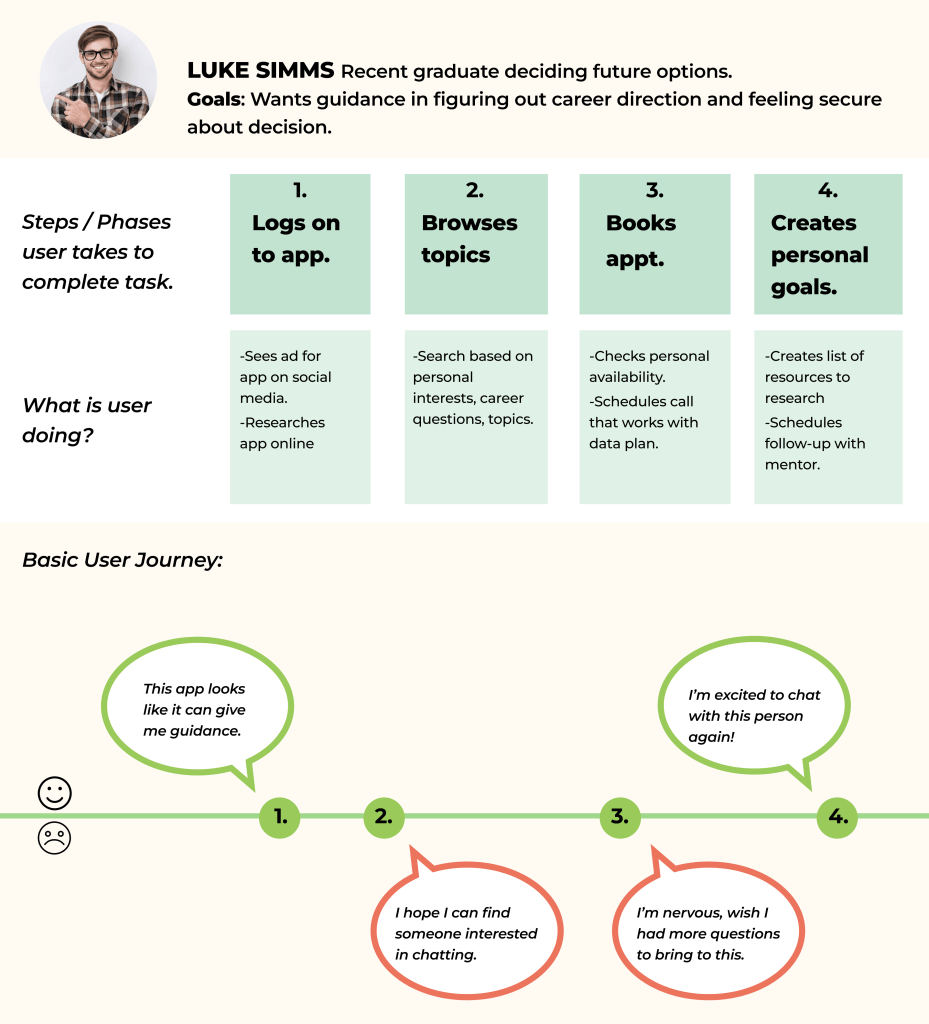
User Journeys
I next identified 3 key features would be most important to my target young adult audience and moved forward to create User Journeys that could illustrate the goals, frustrations and behaviors of my personas before creating my MVP.
Information Architecture
All of my steps thus far has led to some great discoveries that I emerged through this process. In order to prioritize user needs, features and other design choices, I decided to start with a site map.
This stage of the process made me aware of various other things:
- 1. I have strongly researched and considered the young adult needs. How will professionals sign up for this service?
- 2. Thus far I have been designing a mobile app to be accessible by young people. Will a desktop app be a better platform for professionals to understand and connect with the service?Taking these considerations, I designed a site map with both the professional and the young adult in mind to lead my designs going forward.
Wireframes
At this point, I knew I would need to add a way for professionals to connect, but sticking to my MVP, I first wanted to first focus on my key users, the young people, who would be primarily using their phones to connect to the app. I designed these key user flows in the form of wireframes before dedicating to more fidelity.
Having my wireframes that captured my MVP, I next moved into high fidelity prototyping and conducted usability testing with 5 users. Conducting guerrilla testing now helped me focus on the user goals before jumping into design.
Designing
Moodboard
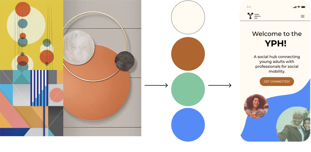
Understanding that my users may be feeling overwhelmed and pressure about the subject this app addresses, I wanted my app to feel inviting, professional and warm and so chose a natural color palette and simplified design style that supported the visual content on each page. I loved the concept of overlapping circles as a metaphor of connecting and building new networks.
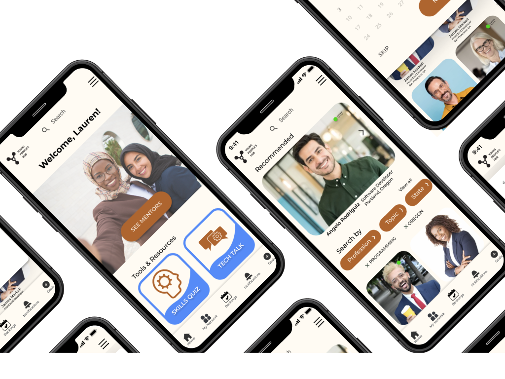
High Fidelity Prototyping
Taking my visual elements, I moved into high fidelity prototyping focusing on the following use goals that I designed into three primary app features.
- Networking
- Discovering career opportunities
- Setting clear goals
- Having mentor support in career journey
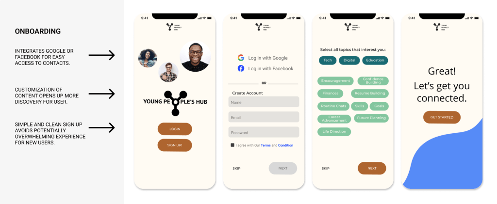
Onboarding
Since one of the design challenges was to provide discovery for users, it was essential to provide customization in the early stages of interaction through onboarding.
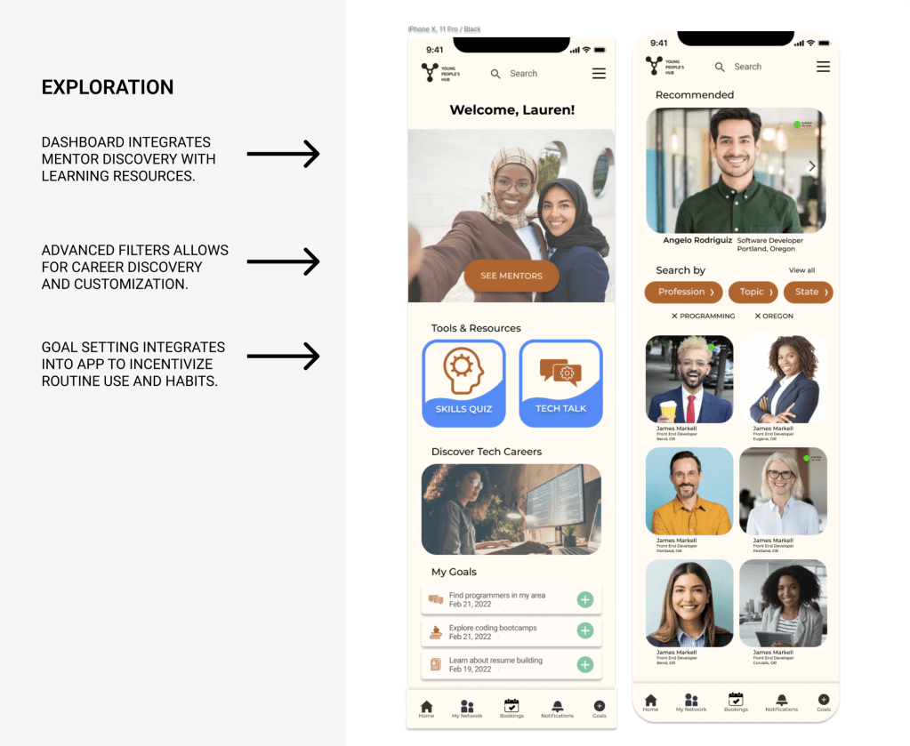
Exploration
The interface is designed to feel like a social media app. The user can browse mentors and explore content that is meant to feel fun and not intimidating. The user can search, schedule and organize their interactions through goal setting with mentors from one app.
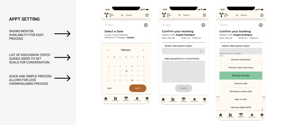
Appointment setting
A built in calendar feature with pre-populated conversation topics guides the user who may not have clear ideas for ways to engage.
Outcome
Since I only had the chance to complete one iteration of user testing based on the MVP, I feel like there is a lot of room for this project to develop. Gamification is one direction I could see strengthening the habits and confidence of the users by offering a reward for setting goals or talking to mentors. Ideally, I would conduct another round of user testing to get their feedback and discover what next steps would lie ahead.
