Mobile App Design for Safer Routing
UX Research/Mobile App Design
Overview
Using secondary and primary research, Shortcuts Mobile App is an opportunity to create a safer mobile routing and navigation experience for commuters that allows for multimodality and community connections.
Role
Project Manager, User Research, UX Architect, Product Design.
Tools
Figma, Google Forms, Marvel, Optimal, Miro, AI.
Project Duration:
6 Months
Problem
Mobility-related accidents kill and injure thousands of people per year in urban environments. Routing apps that exist, like Waze and Google Maps can often cause frustration for commuters who may need very different routes to travel safely and may be left in vulnerable positions.
Solution
The research-based goal was to design an easy-to-use mobile application that allows users to route around relevant hazards and connect with other commuters.
Discovery
Empathizing through Research
Every year, more than 38,000 Americans die in road crashes. According to studies, this was the leading cause of death in the US for people younger than 55 between 2016–2019, the deadliest for pedestrians since 1990. To understand these statics on a more detailed level, I first set out to understand what kind of data defines a crash.
My secondary research continually pointed to roadway design, poor infrastructure, and lack of connected streets were found to be the cause of a high percentage of user-related accidents as users respond to a poor driving environment.
Poor infrastructure is very commonly found in low-income neighborhoods throughout the United States. According to the article, Neighborhood Social Inequalities in Road Traffic Injuries, accidents are highest in low-income neighborhoods where there is least amount of infrastructure investment.
From this research, I was able to conclude 3 main takeaways:
- Road environment is a major cause of most accidents and crashes
- Traffic-related accidents are related to poor infrastructure and road design
- Accidents are highest in low-income neighborhoods (where there is more poor infrastructure)
Screening Users for Primary Research
In my next step, I reached out to users directly through a screener survey. Primary research helped me better understand the commuter’s perceived safety levels and the potential hazards.
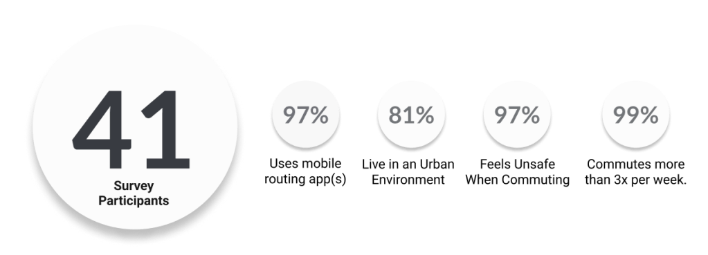
In total, I received survey feedback from 41 participants. Upon interviewing 5 people I was able to validate my problem.
Define
Affinity Map
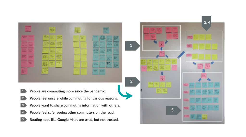
I used an affinity map to download the most important findings and quickly found patterns emerge that helped me further define my problem space.
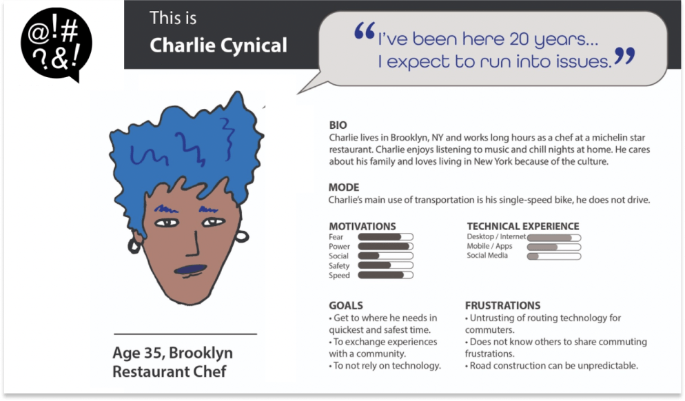
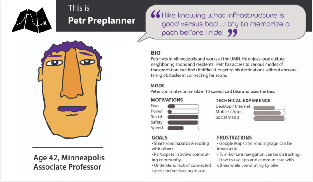
Personas
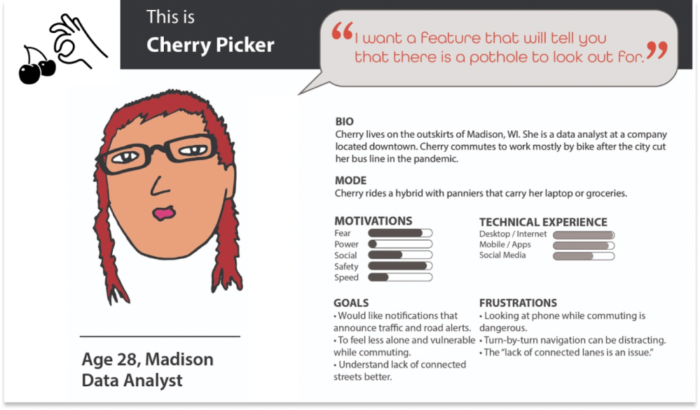
Personas allowed me to capture my collected interview data as identified needs, goals, pain points and see how a user might use a product to address their commuting frustrations.
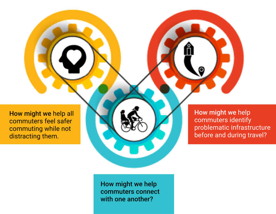
How Might We
As stated by IDEO, “Every problem is an opportunity for design,” and so from these insight statements, the following How Might We questions were proposed to begin discovering a variety of innovative solutions.
Develop
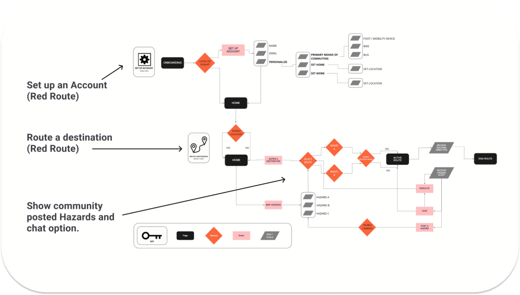
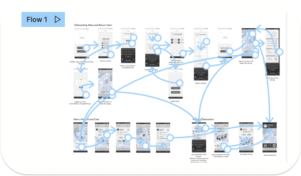
User Flow
To help me capture my MVP, I constructed a user flow of what a basic start to finish journey looks like while routing a destination to see navigation through user goals. This was based around three interaction goals: app sign up, routing a destination and avoiding a hazard.
Sketching for Problem Solving
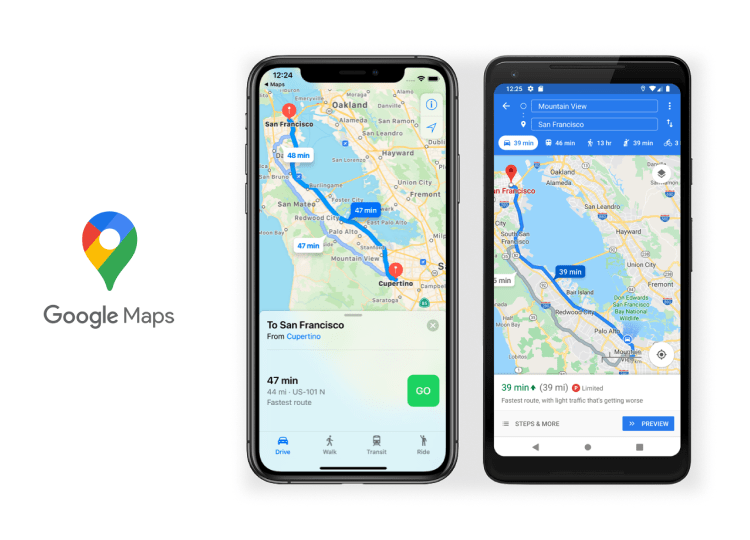
My sketches included both design flows modeled after Google Maps (for user familiarity) and that addressed user’s pain points.
I conducted a guerrilla usability test to obtain initial feedback and validate my user flows that would become my wireframes. I made sure to base screen designs on findings from the user research, where it was indicated that providing quick and clear navigation as well as easy routing was relevant to motivate users to use the application.
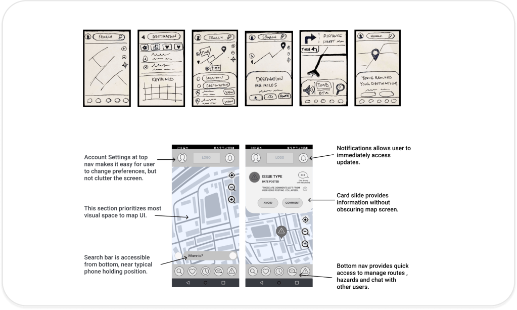
Low Fidelity Prototyping
User feedback revealed a positive routing experience, but frustrations with both chat and hazard features. I revisited user research to explore the following questions to guide my flow development. I used low fidelity prototypes to test these areas for improvement before moving on to visuals.
Deliver
Designed in Figma
I used Material Design as a primary reference for my design system. Once I started building the elements and components necessary for my design to function, I referenced Brad Frost’s Atomic Design for library organization.
I used the following UI elements and components to support a clean interface and provide visual clarity and contrast:
- Analogous palette with vibrant colors
- Material Design based for consistency and user recognition
- Drawers hide menu and secondary material without wasting space
- Slideouts for social interaction windows
- Cards keep primary focus on map and separate information
Refining UI
In my usability testing, I evaluated whether people liked or disliked the chat and hazard features, whether the process of routing a destination was confusing or not, as well as the tone and attitudes towards the prototype presented. I concluded that the following features were important to iterate upon:
Community / Chat features:
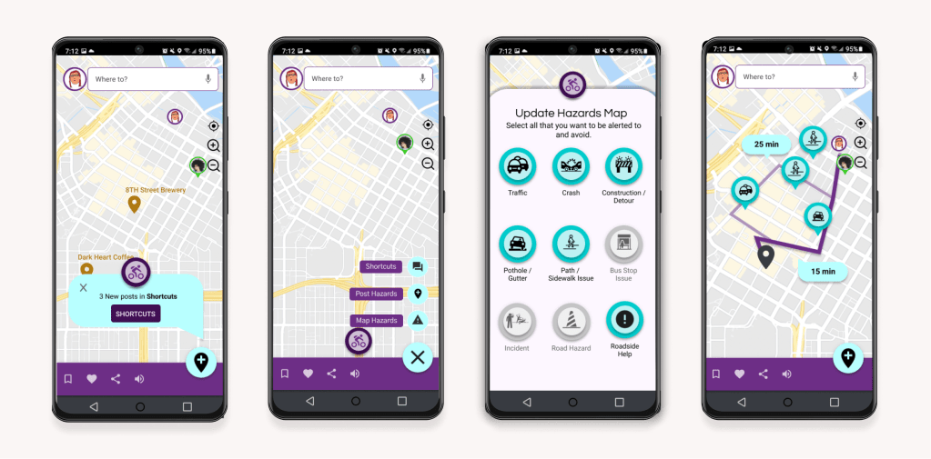
Users said: they would not be able to being able to use chat while commuting.
Action: Chat was changed to a community board where users can share tips and shortcuts before commuting.
Discoverability:
Users said: they want to start routing with the app immediately.
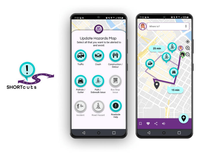
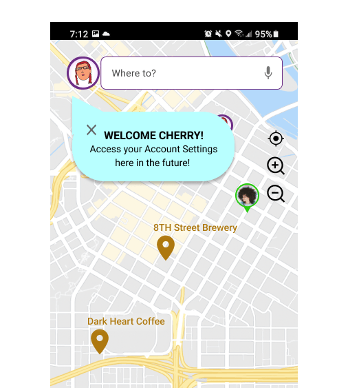
Action: using coach marks, users can easily access My Account, Hazard and Shortcuts community feed features.
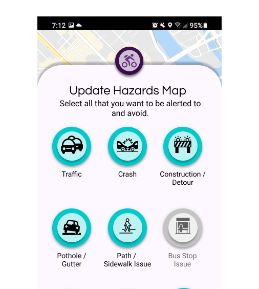
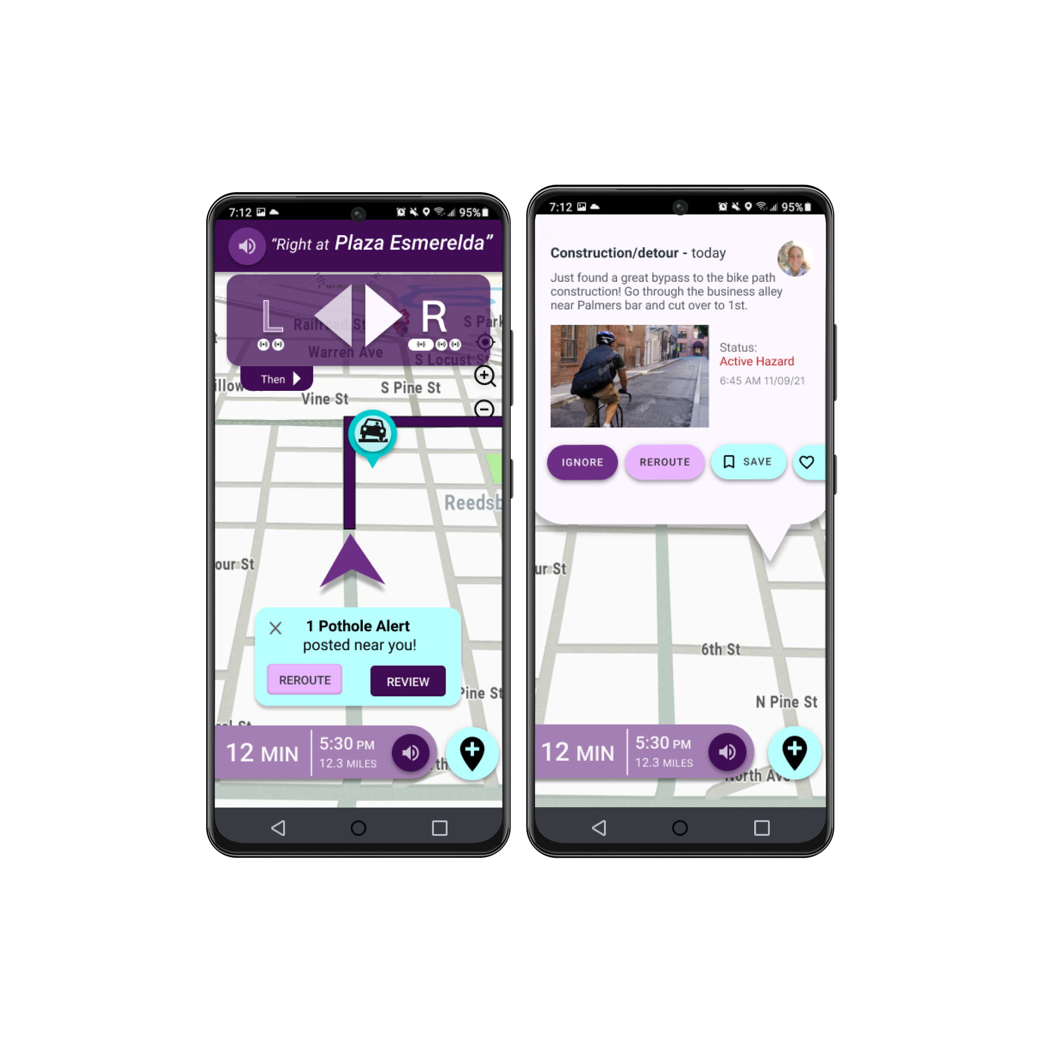
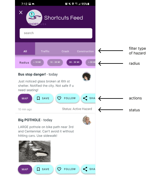
Hazard Markers:
Users said: they want to plan around hazards prior to routing.
Action: Hazards appears on both the map when routing a destination and on the community board when browsing hazards.
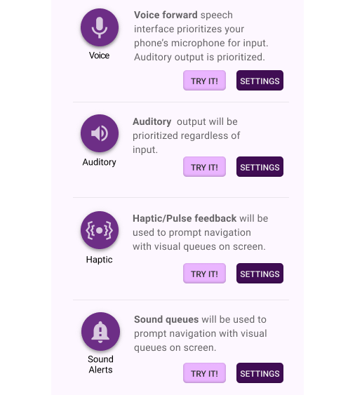
Multimodality:
Users said: NONE of us (cyclists, walkers, bussers) want to look at our phone when we are commuting.
Action: setting control options are meant to customize to unique commuting needs, providing the option to feel or hear what each mode does before commuting.
Challenges & Next Steps
What I learned:
Designing an app for a user that is primarily mobile and not able to dedicate time to the screen was a great challenge. I named the application Shortcuts after receiving positive feedback from users who, in the prototype, discovered that the hazards were fed by community supported data, and provided “routing tips and tricks” rather than algorithmic data. Up until my second iteration, testers seemed interested in the concept of commuter-specific Hazards, but confused with how to engage with them. Giving community-driven intention and enticement to the Hazards through a feed piqued even Charlie’s interest in my last usability testing. I found this a great achievement. I thought I was developing a routing app, but it appears I should have been spending more time building a community app.
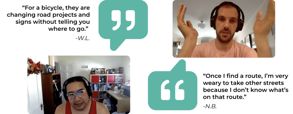
User feedback from initial survey research.
I would love the opportunity to develop this out to a point where I can experience using Community-driven data in this application in a beta testing environment. Designing the accessible and assistive UX/UI and inclusivity will take more times than the 2 iterations dedicated to this project. Shortcuts is one of many concepts that I hope will open doors to problem solving, creativity and redefining human spaces in a virtual world.
