Research-based design proposal delivers for growth.
UX Research / Design
Overview
Using discovery and UX research methods, our team identified opportunities that RV Solar Connections could achieve growth through key enhancements to their website while avoiding a complete website redesign.
Team
Caza Gomez: Owner RVSC,
Kyle Olson: UX Architect / Research / UI/UX Designer,
Catherine Kerwin: UX Architect / Research / UI/UX Designer,
Susan Manzello: UX Architect / Research / UI/UX Designer,
Tiffany Wang: UX Architect / Research / UI/UX Designer
Timeline
4 Months
Problem
RV Solar Connections is a small business with a national reach, but the team of two does not have time to commit to a full website redesign. Our team worked with RVSC toward the goal to identify a MVP list of enhancements that could help them achieve immediate growth and increase conversions.
Opportunities
As a team, we focused heavily on research, discovering opportunities the company can increase sales/conversions on the e-commerce site for customers who already understand their power needs, allowing the owner to spend less time on consultations.
Research
Secondary Research
The Recreational Vehicle (RV) Market in North America is forecast to grow at a CAGR (compound annual growth rate) of 8.18% during the period 2018-2022. Installation of solar technology in RVs will grow due to energy savings.With the installation of external power generators that incurred additional costs and were not environment friendly, RV manufacturers are investing in manufacturing environment-friendly vehicles with solar generators.Seeing the growth of the RV market even more validated the direction we would take to streamline ease of browsing for knowledgeable customers.
Heuristic Analysis
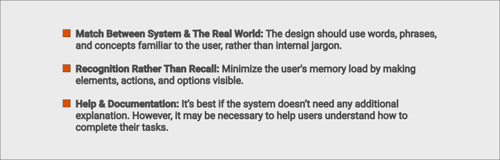
In order to understand the problem a little more, we set out to better understand what competitors were doing. This was accomplished through a heuristic analysis and general research done on 6 different competitor sites. We used 3 of the 10 relevant Nielsen’s Design Heuristics and followed up with a thorough analysis of how the client’s site also compared to the research gained from the other sites.
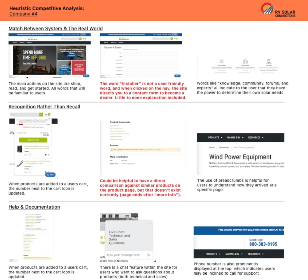
Competitive Analysis
When examining these findings from other competitor sites against the client’s website, we found some easy observations that would lead our next steps of ideation and development.
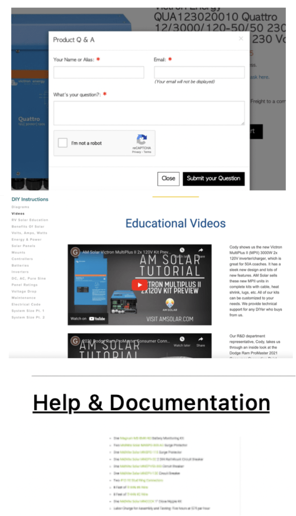
Form attached directly to products for specific question related to products.
Provides video resources to assist their users including DIY Instructions, articles, and education.
Multiple documents are provided, giving user option to read more.
Based on our findings, we came away with a handful of action-items that we thought would be important to incorporate into our upcoming designs:
- Present users with pre-made solar kits as a purchase option.
- Add a more extensive nav menu to the site.
- Provide definitions to users that explain internal jargon.
- Build an FAQ page for questions that users might need answered in order to complete their purchase.
After gaining a strong base of information from the competitive analysis, the team combined this information with our thorough understanding of the client’s users to start building personas.
Analysis
Personas
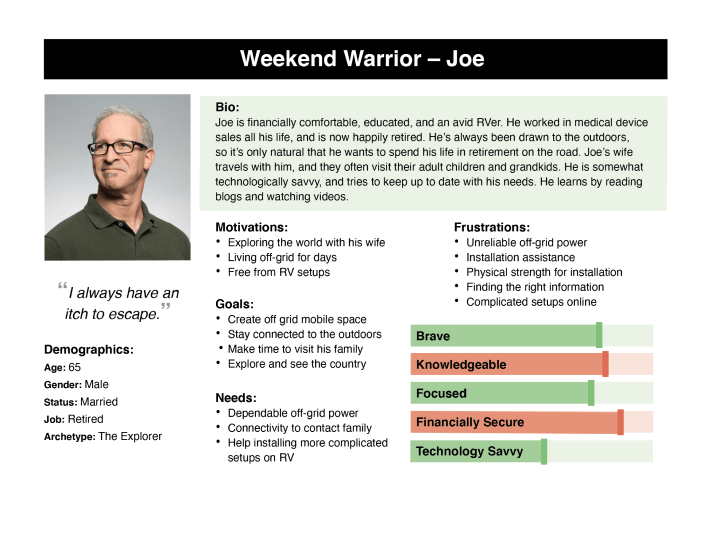
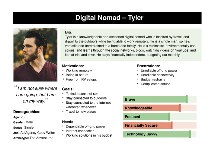
After reviewing this new information with the client, the group decided that the most important way to spend our time on persona development was to focus only on the users who already know what they want and have some knowledge of their solar needs. Although the client understands that these people only account for around 20% of the user base, he also sees the opportunities for streamlined sales with these users that require the least amount of his time for consulting and educating. These two personas helped the group relate to an actual user’s needs, wants, and thought processes, and would be at the forefront of our design decisions moving forward.
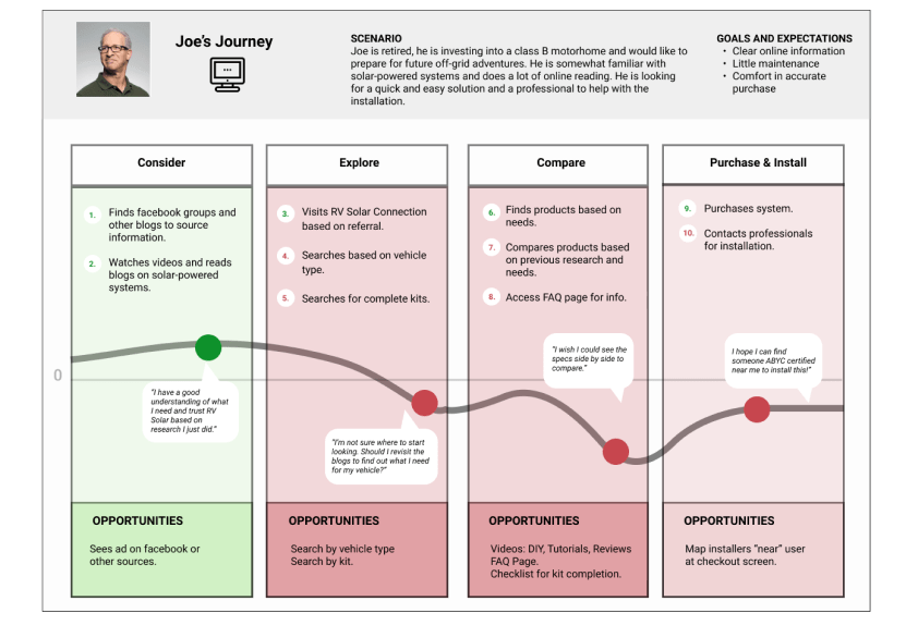
User Journeys
We then examined their Google Analytics and found that the average user was spending 30 seconds on the landing page, most were new users and that they were visiting an average of 1.68 views. While this is all great retention, we discovered the issue upon looking at where these users went next: just under one third of the users were visiting the contact page.
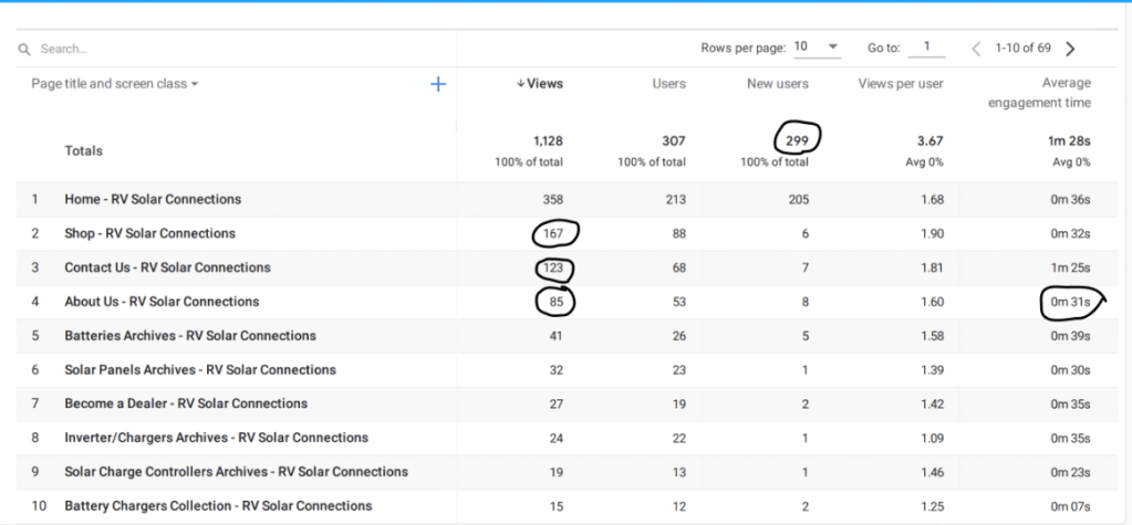
Although half were visiting the shop, the low numbers to category pages show that some users may have been more likely to reach out for help than to explore the products. This helped us validate our initial problem statement.
Growth opportunity: How can we increase product exploration for users that are able to self navigate?
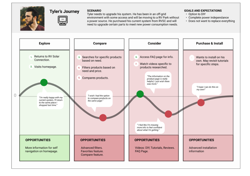
Our User Journey Goal was to show how the current site can provide opportunities for the experienced user, freeing up the client’s time to dedicate to more novice users.
Design
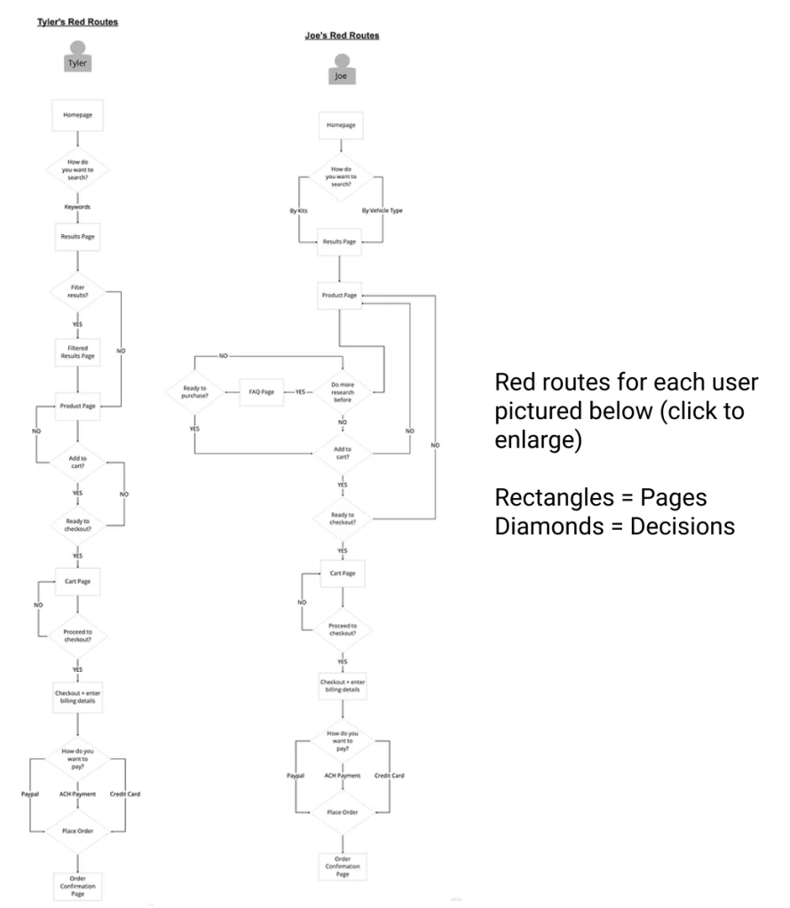
Red Routes
We used the data and insights from the 2 user journeys to create red routes, which helped us and our client visualize the exact decisions both personas would be making as they navigated the site. The red routes for each user represents their most critical path, which in this scenario, is the path to purchase.
Next, we used the user journeys as a base to establish red routes, which helped us and our client visualize the exact decisions both personas would be making as they navigated the site. The red routes for each user represent their most critical path, which in this case, is the path to purchase.
Red Routes for Each User
Rectangles = PagesDiamonds = Decisions
Wireframes
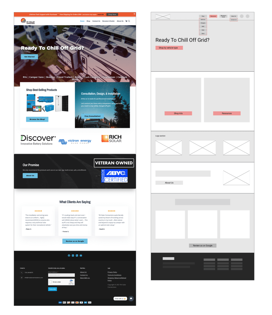
The final part of our project was to translate all our findings into tangible recommendations in the form of wireframes. These low-fidelity screens visually portray the key changes we recommended that our client make to their site, based on our research and understanding of target users.
Homepage & Menu Updates
- Updated the main CTA content to “Shop by vehicle type” so that users could shop for products that best suit their needs, replacing the “Get Started” link leads to a contact form.
- Enhanced CTAs for Resources and Kits on homepage. This will encourage users like Joe, who understand customer’s needs but still have some gaps in knowledge, to complete their purchasing journey on their own.
- Added drop down category links under “Shop” to provide users a quicker way to orient themselves and start shopping.
- Removed the “Home” button from nav as it is redundant.
- Nested “Contact us” under “About us” to free up space, and also encourage users to begin their shopping experience before immediately reaching out to the client for advice.
- Added a link to Resources to include FAQ and tutorials.
Page Additions
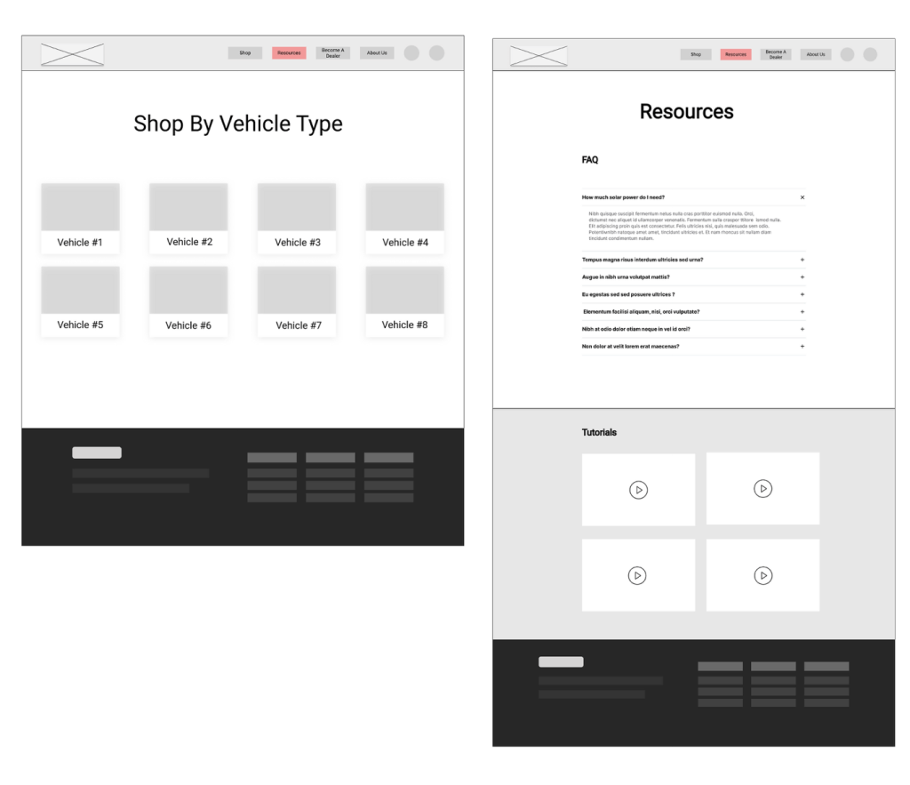
We created an additional page for users to choose the vehicle type they are shopping for, in order to help them narrow down their search. This should greatly benefit users like Joe, to help direct him in his shopping needs. The “Shop By Vehicle Type” page is where users will land after clicking the CTA prominently featured on the Hero image of the homepage.
We also created a resources page, that includes a section for FAQ and tutorials, so users who are on the fence about buying a product because of an outstanding question can find answers directly on the RVSC site, and won’t abandon their web session.
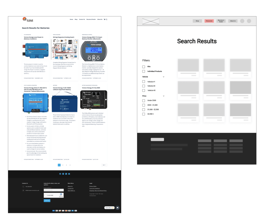
Search Results
The key change we recommended making to the search results page was the addition of filters. We included kits, vehicle type, and budget in our filter list. The current search results page does not allow the user to hone in on the items they are looking for, and both Tyler and Joe could make use of a filter feature. Joe might decide he wants to only look for kits, as opposed to individual products, while Tyler might be looking for a particular product, but on a budget.
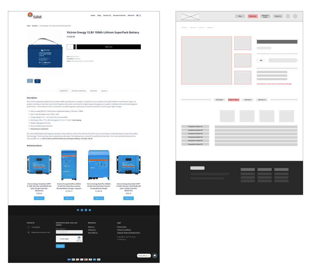
Product Page
The current product page is organized in a way that some users might find confusing. There is a lot of white space, and users need to scroll down to find pertinent product information.
We recommended that the client rearrange the product image and its thumbnails to make the page more visually appealing, and remove the excessive amount of white space. Moreover, we recommended adding a comparison feature, so users can easily understand the difference between the product they’re viewing, and similar products. Providing users easy access to direct comparisons will give them confidence, knowing that what they are buying is the best option for their needs. Ultimately, buyer confidence should increase conversion rates.
Outcome
In the future, RVSC plans to work with other designers to continue growing their business. Our timeline did not allow for user testing, which will be crucial for understanding whether our proposed changes will amount to increased conversions. During our final meeting, we provided the client with a recap of our process and next steps he can take with another team. Collaboration amongst our team members was paramount to the success of this project. Each designer’s unique perspectives and work helped in delivering the best end result for the client. When implemented, we believe our recommendations will allow users who understand their buying needs to more seamlessly navigate through the RVSC site to find, and then purchase, the items they need.
Had we not worked closely with the client and spent as much time gathering information about his needs, I believe we would have taken a very different approach to the process.
