Reconnecting with Consumers
through a Web Redesign
Website Design/ UX Design
Overview
Using research to uncover how poor site mapping and navigation were leading to missed sales and upset consumers, I worked with a development team to create a customized website solution based on user needs and improved accessibility.
Role
Creative Lead | UX Designer
Timeline
9 Months
Problem
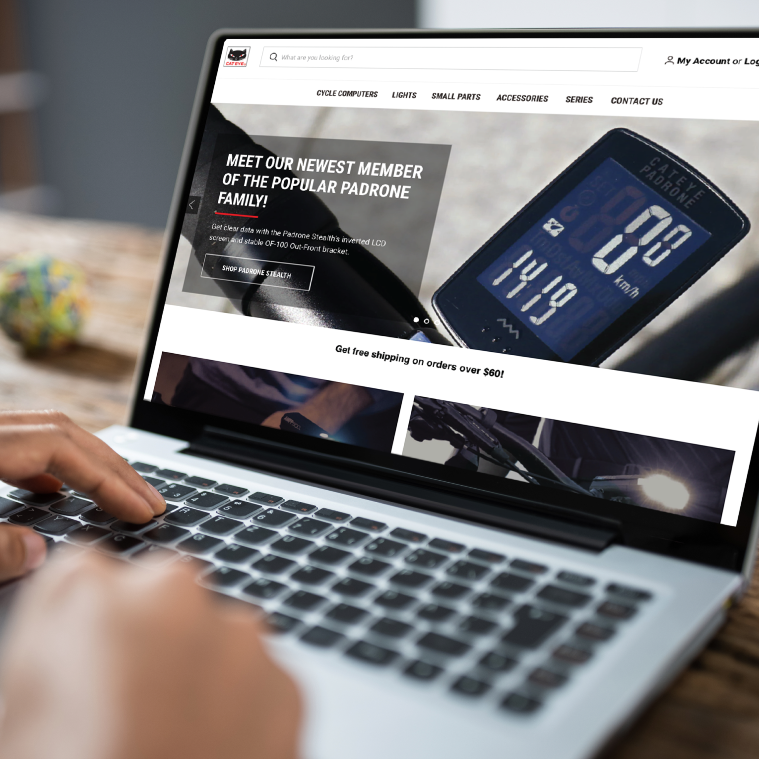
Cateye America experienced a rapid drop in visits and sales. Based on direct customer feedback provided by the Cateye Technical Support team, we found that potential customers were leaving the site because of confusion over product details and site navigation.
Solution
Using various user research methods, I discovered an opportunity for Cateye to redesign their user experience, additionally validating a migration to a different e-commerce platform that would better fit the product and user needs. Having secured a timeline and budget, I worked with a development team and led a customized site design with end-to-end user experience methods and accessibility compliance.
Website redesign goals
- Responsive design that works across devices
- Social media widget integration
- Lifestyle videos and imagery
- Automated warehouse management
- Interactive design infoblocks
- Quick add-to-cart features
- Advanced product filtering & searchability
- Consistent product attributes
Research
I started with competitive research in the cycling electronics and outdoor industry space. Pricing models were considered based on our current content as well as our future roadmap.
For visual direction and best practices for incorporating lifestyle content I looked at Patagonia. I also closely examined information architecture of other sites using the BigCommerce platform, including those from Santa Cruz.


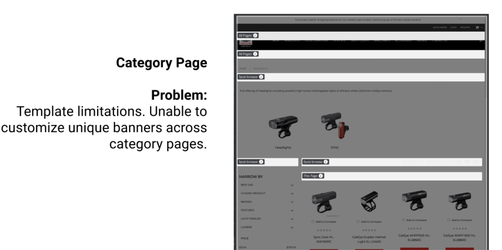
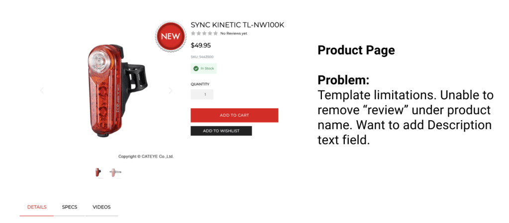
Identifying Pain Points
Knowing that users were having a difficult time navigating product, we developed a set of user studies to help identify specific pain points and goals. Out of a series of questions asked of users by our Tech team, we found the following screens to be most problematic for users while searching for a product.

Site Architecture
I knew that we needed to understand our user pain points before we could start designing. Our Technical Support specialists had sited users being “confused” and having issues finding products on our website. Creating site architecture helped visualize complications in our organization. I sought to eliminate confusing categories in and have revised architecture prepared for the data mapping in the next stages of the migration.

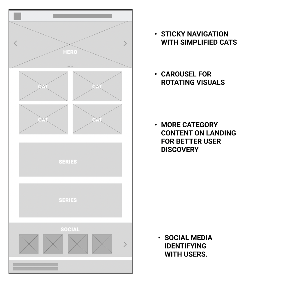
Wireframes
Having added more resources and eliminated unnecessary categories, I could next design to bring these resources to life. Based on previous research, I used Sketch to design simple wireframes that captured these user-based considerations and to pass on to the development team.

Moodboard
Understanding that our users were feeling overwhelmed in visiting the legacy website, I knew the design elements in the redesign had to be simplified. Since I had been establishing a new look and feel with video & photo content for the brand, I also wanted to give this content room to shine. I used a combination of Material design, our new dynamic visuals, and subtle classic CE branding elements that our users are familiar with to model a style guide for our prototype.


Designing
Discovering earlier pain points helped us iterate our base goals and focus on these key features for our working prototype:
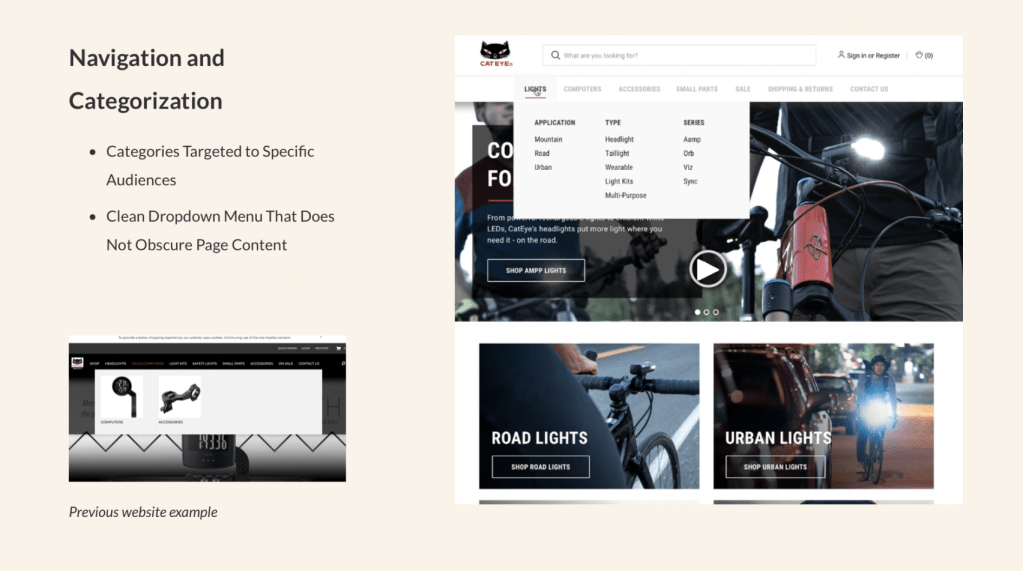
- Navigation: Add more clear product categorization based on cycling type.
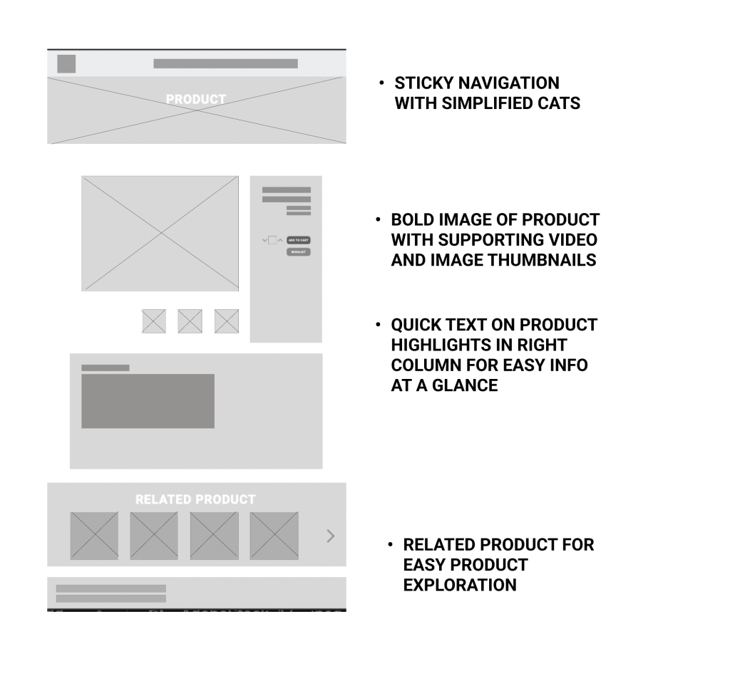
- Product Pages: Design with large images and flexibility for integrating content on individual pages.
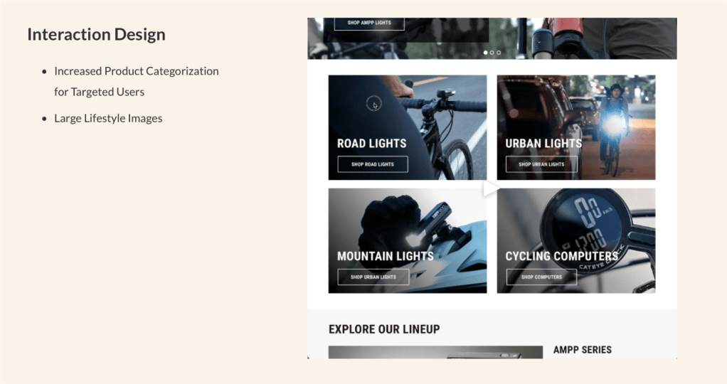
- Interaction Design: Increase lifestyle images with featured content with clean UI.
Prototyping
These are the revised design directions based on the same pain point examples from earlier research:

Outcome
After releasing the new website we concentrated on regularly refreshed features and content. We strived for a balance between a minimal impact to the experience of our legacy users and an appreciation of added value to all new users. By conducting upfront research and consulting with industry experts we did the work to set ourselves up for better conversions and retention going forward.
